Having a difficult time visualizing a new kitchen design? You're not alone. Even professional designers humbly admit, "practice makes perfect."
What does this mean for you? You, too, can have the ability to train your eye to visualize your kitchen in a whole new way.
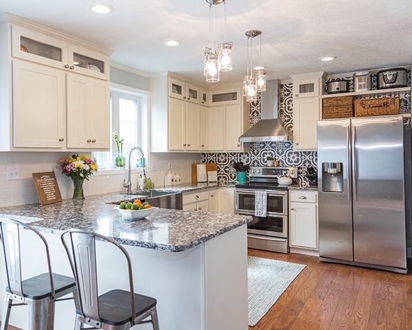
Yes, it takes practice and, yes, you may still struggle a bit. However, we feel confident that after reading the following explanations and examples - you'll have a better-trained eye and an easier time picturing future kitchen design ideas in more exact ways. And, that newfound ability will ease the way when you meet with your kitchen design team to move forward.
Step One: Familiarize Yourself with Design Basics
There are very specific tenets of design - or design basics - that all but the most eccentric designers consider when looking at an existing kitchen, envisioning how it could be different.
While it's true that function matters, it's also true we want to provide that function within a visual framework that adheres to certain design (artistic) principles.
These include things like:
- Unity or harmony - elements should work together to create a united theme or energetic resonance.
- Balance - objects should be balanced - this can be done symmetrically, asymmetrically and/or radially (more on that below).
- Rhythm - there should be a semblance of order within design elements, and this is carried out rhythmically via repetition, alternation and progression.
- Emphasis or focal point - there is a singular (maybe two in a very large space) emphasis or focal point that draws the eye, to/from which all other elements compliment or contrast.
- Contrast - without contrast, rooms appear washed-out and lose any sense of boundaries/borders - a reason why monochromatic designs will use texture or variations in lines and shapes to make up for lacking contrast.
- Scale and proportion - another way balance comes into the mix, for example, hanging a proportionately-sized chandelier in an eating area with a high ceiling – which serves to marry the high- and low-points.
- Details - these are the "little" things that make all the difference - pops of color, glass cabinet inserts displaying heirloom dishware, just-right suspended fixtures over the kitchen island, etc.
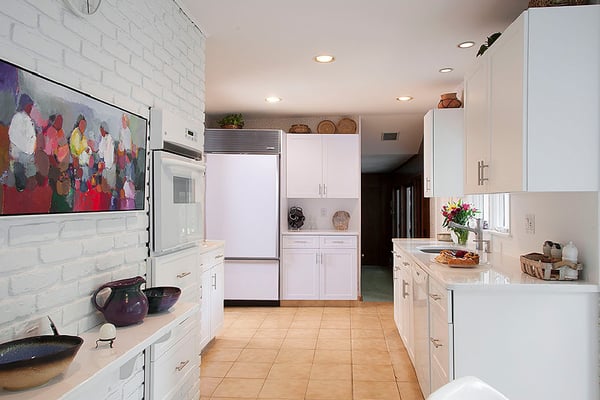
See? Just learning about these seven tenets of interior design already hones your eye in a more "expert" way.
Step Two: Visual Composition & the Quest for Unity
Design Basic #1 above was "unity or harmony" and this is a very holistic concept. It actually encompasses all of the following six other elements. There are several ways you can go about this - but here are some simple steps to guide beginner designers as they re-envision their kitchens.
A really big-picture place to start would be your overall design style - are you going traditional? Transitional? Modern? Post-Modern? Mediterranean? A single consult with a kitchen design professional works wonders for teasing out your preferences if you're currently unclear.
What's the focal point?
When you and your guests walk or gaze into your kitchen - where does the eye land? Is there already an interesting architectural feature to highlight? Will it be a stunning backsplash design? Is it the spectacular kitchen island? The colorful kitchen chairs and accents? Perhaps you have some unique appliances?
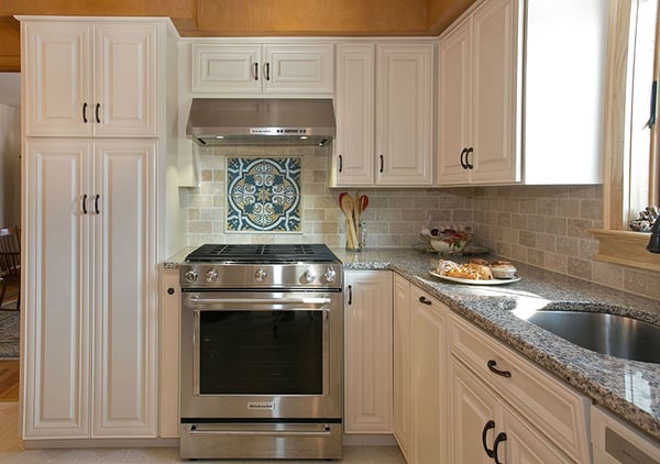
Start there and your design will come together in layers that support the main themes.
Draw the eye
Once the focus is established, you'll use lines, lighting and color variations/contrasts to draw the eye towards the focus. This will further unify the design, and instantly generate cohesion.
Create balance
You'll then work to create balance within the design via symmetry, color, contrast and texture.
- Symmetry: This Article has concise examples of symmetrical and asymmetrical design definitions. Radial symmetry is another type of symmetry that moves out in a circular pattern, like spokes on a wheel.
- Color: Color is used in a variety of ways, ranging from monochromatic, complimentary and contrasting - and with respect to the color wheel. Learn more in, How to Design Your Kitchen From a Color Palette.
- Contrast: This is the yin/yang principle in tangible form - dark/light, smooth/rough/, lines/curves, tall/short, wide/narrow. Contrast keeps things interesting.
- Texture: A more 3-D version of contrast, textural variance keeps your kitchen from being too smooth, or too rough - yielding a multi-dimensional aspect.
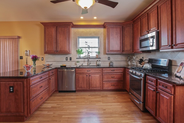
Step Three: Provide movement via rhythm
Finally, you'll want to add design elements that provide a sense of rhythm - which translates to visual movement. This is done in three ways:
Repetition: Repeating anything from a pattern, line direction, color, shape, etc. - or a repeating series of elements - creates continuous movement. Alternating elements is another form of repetition.
Progression: Countertop flour/sugar/coffee containers offer progression via increasing sizes; colors progress from light-dark-light or between different shades of the same hue - all are examples of progression.
Transition: This is a subtle form of movement that slowly transitions the eye from one area to the next, like an arched doorway or curved countertop surface.
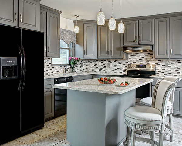
Now it's time to test your trained eye and visualize your new kitchen design. Then contact Kitchen Magic to schedule a collaborative consultation.


