
Color is such an important element of your kitchen design. The color palette you select, or inadvertently wind up with (depending on your design approach) will set the tone for your kitchen's personality. Is your kitchen's color scheme warm or cool? Fiery and energetic, or tranquil and calm? A place for socializing or a utilitarian food prep space?
Your kitchen design's color palette will drive these "feelings" home for both family members and guests, alike.
Notes About Numbers: Before we proceed, we need to make a mention about numbers. During your palette research and selection, odds are you’ll come across color numbers, as well as color names. They are either hexadecimal colors or PANTONE colors. The former correlate with digital/web design colors and are preceded by a #, the latter are associated more with print-based colors and are preceded by PANTONE or PMS. While there’s no direct “translation” between the two, your designer can help you find a corresponding color from one to the other.
Tips for Designing Your Kitchen's Color Scheme
Perhaps the easiest way to start is to work with Pantone's Spring Palette for 2018 to design your kitchen colors, and gain inspiration from examples of how these colors have already been used in designer kitchen galleries - with beautiful results.
You'll notice the Pantone palette continues honoring a nice blend of cool and warm colors, as well as a balance of neutral and accent shades. The notable difference in 2018's colors is that they're more complex, including vivid, dramatic color combinations. This means there’s no need to constrain yourself to standard colors for a particular design approach.
Now, for the fun stuff. Here are three examples from the Kitchen Magic gallery showing how a Pantone-esque palette can be used to drive your kitchen design.
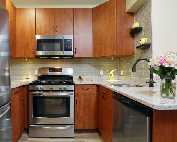
Warm with a Cool Accent
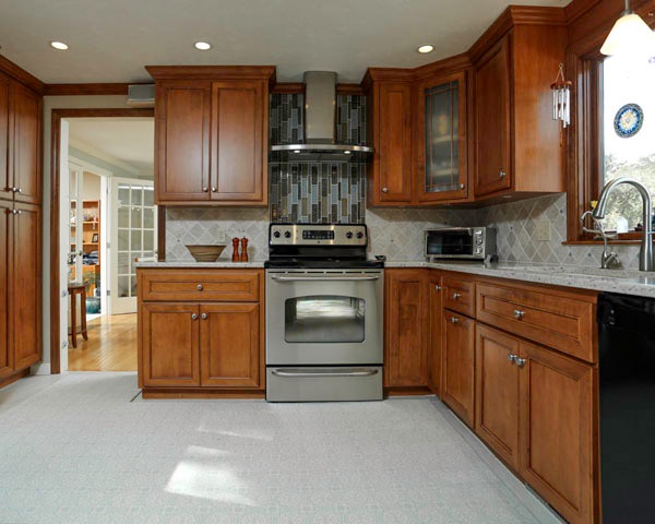
In this kitchen, the rich warm tones of Washington-stained maple cabinets highlight rusts and reds (like Pantone's 18-1440 Chili Oil) and are complemented by a cool backsplash that includes colors similar to Little Boy Blue, Sailor Blue and Harbor Mist.
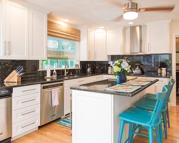
Contemporary with Warm Accents
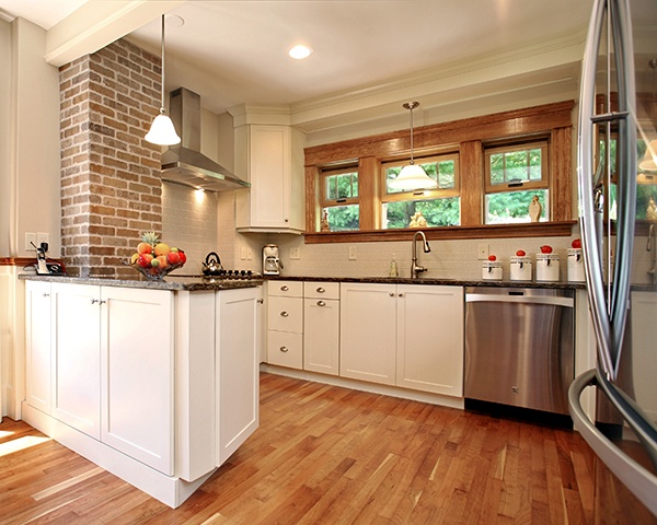
The inherently warm brick chimney feature and wooden window sills got a contemporary update via white cabinetry and stainless steel appliances (a nice collaboration of textures!). Additional pops of color come via countertop accents that bring bright Cherry Tomato-esque splashes to the table - and don't underestimate the power of incorporating outside views - like lush green foliage - which becomes a part of the design via picture windows.

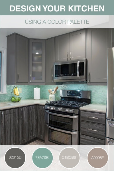
Cool and Modern
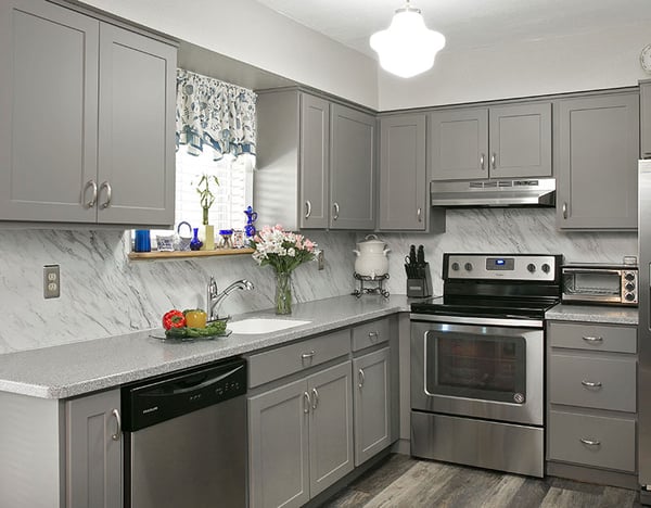
This kitchen could be showcase for Pantone's 2018 Palette, including a gray, Harbor Mist foundation, pale Coconut Milk themes, not to mention pops of Sailor Blue on the window sill. A cool and modern, neutral design, forms a backdrop for any of Pantone's complex and dramatic color accents.
Complex Colors Thrive as Changeable Accents
If you've followed Pantone's color sheets through the years, you know they're all about transient trends that evolve, ebb and flow over time. Remember, they're fashion designers at heart!
For that reason, Kitchen Magic designers typically select warm or cool neutral backdrops, that resonate with a client's particular design style. Then we play with brighter, dramatic pops of colors via accents that are easily changed over time. This prevents you from regretting a large swatch of Arcadia cabinets in five years, but allows you to easily repaint/refinish the Arcadia-inspired bar stools when you're ready for a new color pop!
Of course, if you have your heart set on your very favorite, bold color, that's fine too. We agree with the statement, "there's no such thing as a bad color, only bad color combinations." So, keep that in mind as you work with your kitchen designer. If you do opt to go bright and bold, do so with a forward-thinking approach.
For example, rather than painting cabinets that color (which is nearly impossible to "un-do" via repainting), use it as an accent for island cabinets only. Or, choose a quartz slab that includes some fun colors of choice, so you can use colorful accents (window treatments, area rugs, vases, china, etc.) that feature and highlight different shades from the slab's color mix through the years. This offers the best way to embrace current trends and exciting color play, without installing permanent and/or expensive features that can't be "undone" when you're ready to embrace the next round of trends.
Ready to re-vamp your kitchen color palette using a fresh burst of inspiration? Schedule a free, in-home consultation with Kitchen Magic.
For more advice and tips on how to design your kitchen, check out these related articles:
- How to Match Your Countertops, Cabinets & Floor
- Our 5 Most Popular Kitchen Cabinet Colors
- Are Kitchen Hardware and Lighting Supposed to Match?
- What Countertop Color Looks Best with White Cabinets?
- How to Pair Countertop Colors with Dark Cabinets
- What Countertop Color Looks Best with Cherry Cabinets?