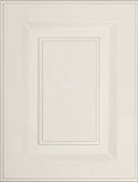
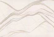
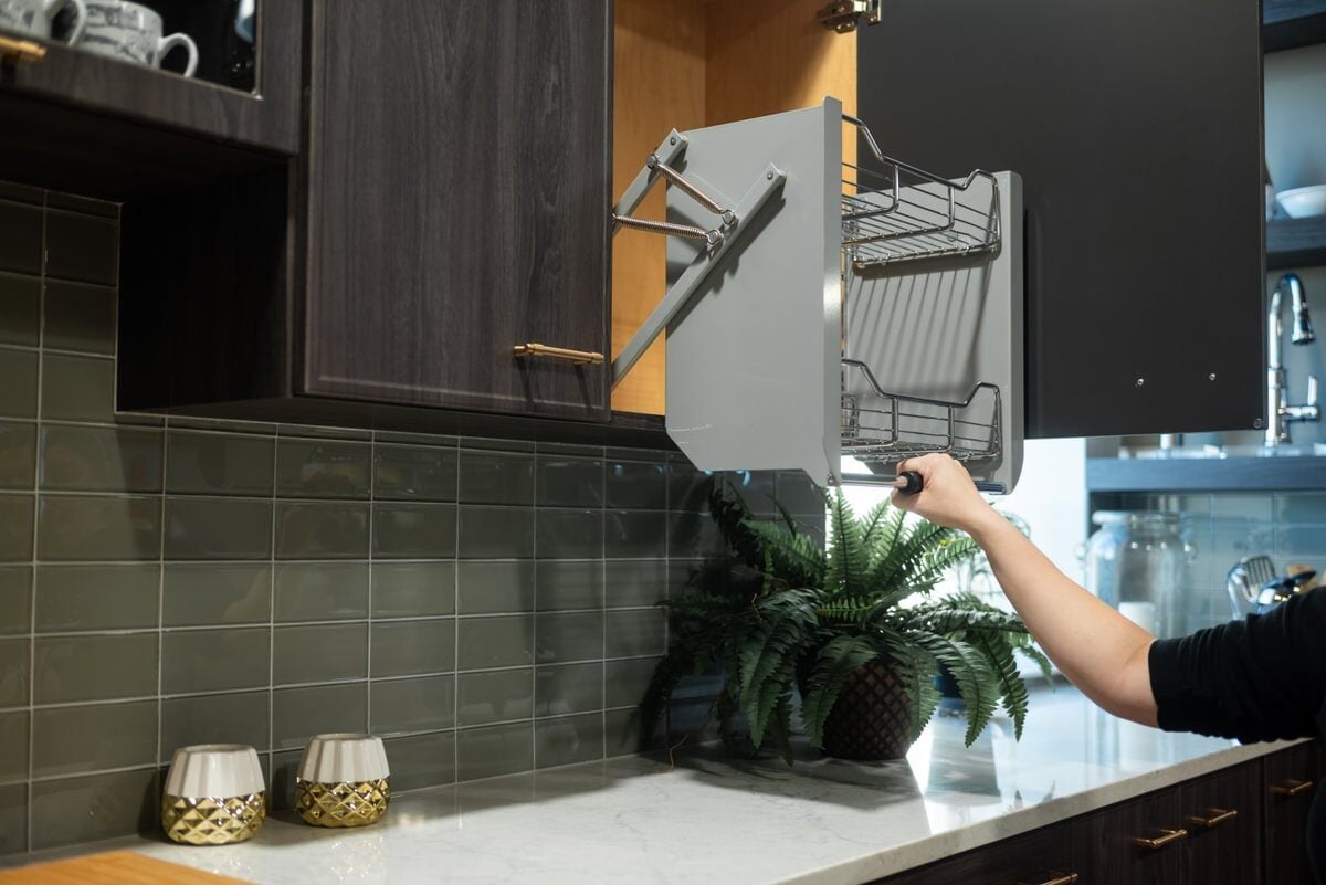
Cabinets? Check! Countertops?Check! Appliances?Check! Color Scheme?Check! Texture...Texture... Hey! Did anyone think about texture!? When you’re updating or remodeling your kitchen there are a lot of things to think about. But remember, those little details make a huge impact and texture is one that people may often overlook.
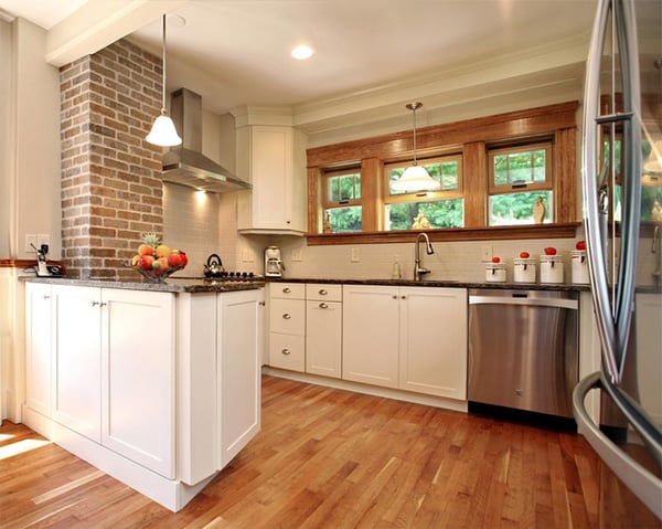
The Importance of Texture in Kitchen Design
If you're not careful, you can wind up with a whole lot of "shiny-and-smooth" kitchen features, without any textures to balance it out. Even modern kitchen designs, which are known for their sleek and streamlined finishes, can wind up looking flat if you don't find a way to mix it up.
Texture helps to add depth and interest to interior design spaces, and it's an especially crucial element if your design palette falls on the all-white or monochromatic end of things.
Here are a handful of ideas for adding texture in your upcoming kitchen remodel, to make sure you keep things interesting.
1. Mix Up the Elements
We mean this literally. There are a wide range of natural and manufactured elements you can incorporate into your design, like wood, stone, metal and glass. Use a combination of these and your kitchen will gain an automatic "surface lift." The kitchen pictured below is a texture-rich example. Look how well the brick wall, beautiful wood floors, slick countertop, and stools work together. The space is anything but boring and the hanging artwork provides additional color.
2. Use Patterns
Even if the patterns are created from similar finish tiles, they still provide the visual impression of relief, dimension and texture. For example, take a look at the backsplash below in this Darlington's Gray Kitchen. In truth, the tiles are smooth and shiny, just like the countertops, cabinet finish and appliances. Even so, with the use of smaller tiles (creating more lines and depth between tiles and grout) and a multi-colored pattern, the backsplash has a textured look.
3. Distressed or Glazed Finishes
Anytime you add a distressed or glazed finish to cabinets, you gain instant textural appeal. Distressed cabinets are a more dramatic example of this—with the varying colors and heavy brush strokes yielding almost a faux-wood appearance. However, even a very gentle glaze will add a bit of dimension, and will help the cabinet details and edges to rise up a bit from their one-dimensional faces. Take a peak at the kitchen below. The cabinets have a distressed finish that makes the white cabinetry jump out a bit. The backsplash tile also provides additional layers of textural appeal.
4. Beadboard Panels
Are you planning on installing a peninsula or island with a raised bar? Consider adding beadboard panels on the side that are visible from the adjacent living space(s). It's an attractive finish piece that ads texture on a surface that is typically flat and boring. You can see the difference it makes in the kitchen below. That design is another example of how texture keeps things interesting; note the backsplash tile pattern and the molding at the top of the cabinets as well.
5. Details, details details
If you're planning a traditional kitchen design, your texture is all in the details. By details, we mean the lighting fixtures, cabinet door knobs and pulls—including the finishes, and the sink.
You can see a wide range of these detail examples in the kitchen above. The recessed cabinets and textured farmhouse sink work together to make a stunning artistic impression, as does the lighter-colored island countertop, which balances out the heaviness of the slightly darker cabinets. The lighting fixtures top off the space with a personal touch as well.
Feel like your kitchen design may be a little too one-dimensional for comfort? Come on by the Kitchen Magic showroom to discuss your textured options.


