Contrast is an important part of interior design no matter what room you’re designing. Simply put, contrast is used to highlight differences between objects in the same space. Even a monochromatic palette should include variances, typically in the form of accents or transient objects that pop out from a neutral background.

3 Examples of Contrast in Kitchen Design
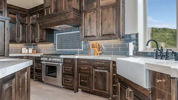
In the world of interior design, we typically think about contrasts in terms of color, angles, or texture. For example, adding a rounded hood or arched trim in a kitchen which is largely comprised of sharp angles, or using a textured backsplash that has a majority of sleek or glossy surfaces will break up the visual space.
The trick is that contrast should be so naturally done, that it's hardly noticeable. The design is so fluid that each little detail offers perfection on your space. Below we describe three ways where contrast can enhance your kitchen design.
1. Contrasting color designs in the kitchen
One of the easiest ways to add contrast is through your color choices—think the light vs. dark motif. If you’re all about the monochromatic color scheme break it up with bold dark accents or colors.
Contrasting colors for kitchen countertops and cabinets
A common place to add contrast is through your wall paint. But why not take it a step further? A white kitchen is timeless, we all know this. Break away from the pack and create a space that’s unique to you by going with white cabinets and dark countertops. The light and dark combinations create stunning visuals that always work.
Cabinets take up a majority of the visual space in your kitchen—about 80%! You want to choose a color that you’ll love for years to come. Don’t forget about the countertops though. Over doing one color could be overwhelming, especially if it’s a small space. Breaking it up with contrasting countertop colors could transform your room from monotonous to magnificent.
Use contrast to allow dark cabinetry in a small kitchen
Using light colors is one of the most standard rules for designing small spaces, but what if you're a fan of dark colors? Not to worry. You can still enjoy darker shades and accents in a small kitchen design by working some contrast mojo.
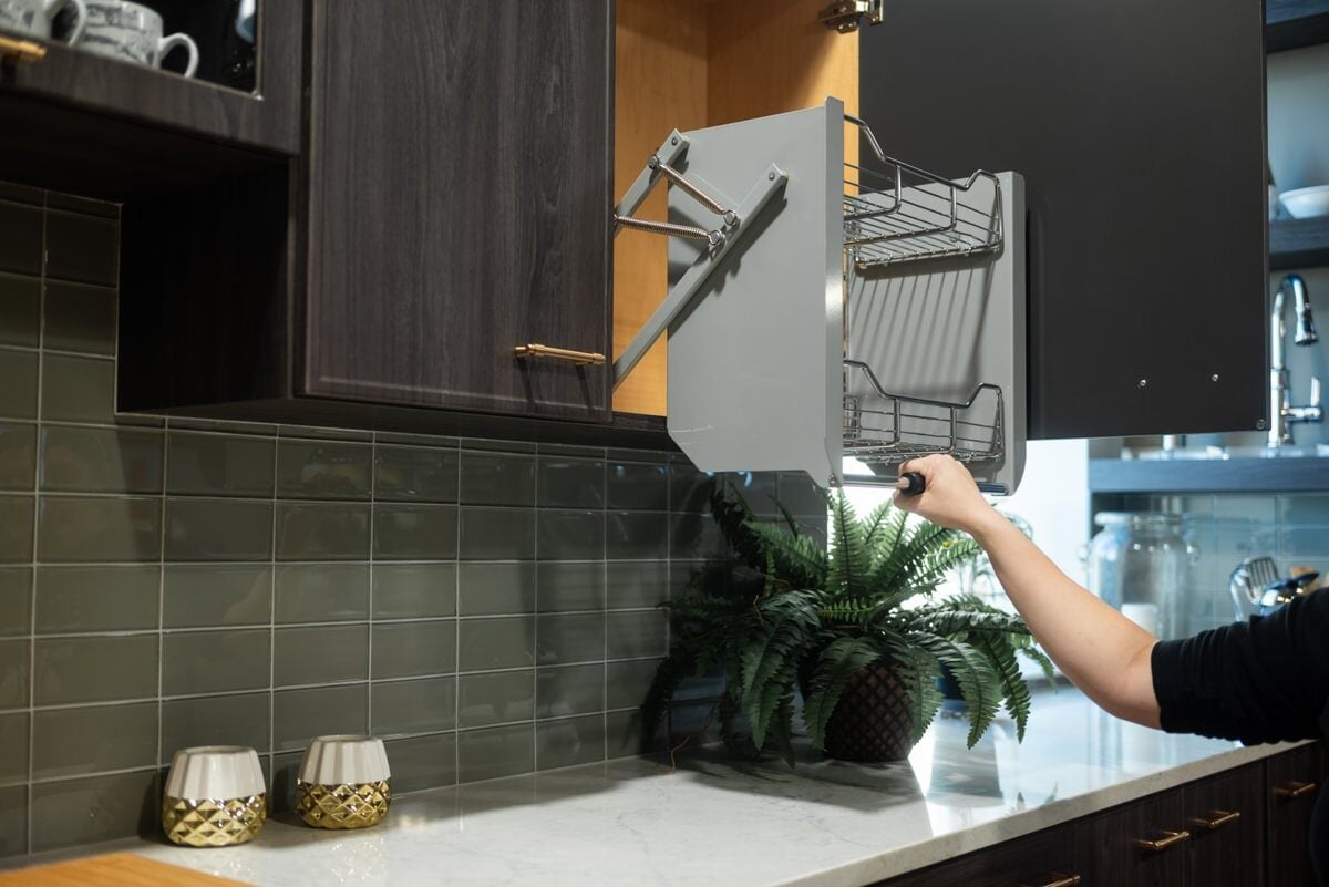
Another way to go about it is to use lighter flooring, backsplash tiles and wall colors, so the perimeters are open and the darker cabinetry creates the anchor. When contrasts are well-balanced, dark features won't contribute to shrinking the space, or the claustrophobic feeling people worry about when they envision dark colors in small rooms.

Use contrasting colors for your kitchen island
Mix-and-Match cabinetry is another popular way homeowners add contrast to their kitchen design. Using a contrasting color for your kitchen island is one of the simplest methods for doing this.
You can really make a statement with a well-designed island. Make it the focal point of your room. It may already be the gathering spot for family and friends, so give them something to talk about!
It’s become commonplace to have perimeter colors in one shade and the island in another. You can also use it as a vehicle for more bold or bright colors. Even if your style preferences change down the road, islands are easier to repaint than the entirety of your perimeter cabinets.

2. Texture and pattern contrasts in the kitchen
If you aren't careful, your kitchen will become a sleek, shiny showpiece...that falls flat. This is where texture and pattern contrasts become important in your design.
Create drama with contrasting textures
Areas where you can include textural contrasts include:
- Backsplash tiles. Things like pounded metal or tile backsplash patterns in bolder colors will create a little texture between the smooth countertop surfaces and cabinet faces. A backsplash is an opportunity to add both color and texture contrast.
- Flooring. Think about the materials you use for your flooring (tiles, wood, etc.). Even consider any patterns you might throw in there (herringbone wood or square tiles) they help break up a uniform space.
- Appliances. If you’re going with glossy or semi-glossy finishes throughout, then you might want to create some textural contrast with a matte finish instead. If you’re not into matte paint or even cabinets, then think about it on a smaller scale like faucets and appliances. It helps add some textural contrast to the room.
- Distressed finishes. Add texture with something as simple as a warm glaze on white cabinetry, or you can create bold textural accents by choosing a distressed cabinet finish.
3. Contrasting materials in the kitchen
We want to be clear—the materials you choose to incorporate in your design will add a level of contrast to your space. Usually this results in textural contrasts, but we wanted to point out specifically how these materials make an impact in your kitchen.
Let kitchen lighting fixtures illuminate the differences
Not only does appropriate lighting shine the spotlight on all your work stations, it also adds a bit of flare. You’ve got options to add some visually appealing items and contrast with your choice. If you’re into the lavish look, a grand chandelier made of crystal or glass makes a big impact. If you're creating a warmer, homey feel you might get a little funky with mason jars or other materials.

Accents accentuate kitchen contrast
Accent pieces like stool seating for the island or a decorative wall clock is another way to create some textural contrast. Pick comfy seating options with velvet cushions or decorative patterns. Break up the sleek, glossy look with soft and inviting fabrics.

Bring raw materials inside the kitchen
Raw materials such as brick, wood, and stone bring out a sensual, earthy vibe to your room. An exposed brick backsplash or wall creates a rustic accent and focal point. Welcome guests into your space with natural wood elements like exposed beams. You'll usher them in for a delicious meal or drink with warm and inviting energy.
The design team at Kitchen Magic is happy to discuss multiple ways you can balance contrasts in your upcoming kitchen remodel.
Hungry for more kitchen design ideas, take a look at these articles:


