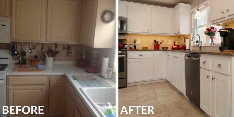
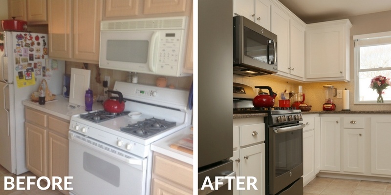
If there was one word to describe this New England kitchen before its trendy facelift - it would be 'bland'. Taken in its parts, the oak cabinetry, neutral colors and high-quality finishes were solid. As a whole, they created a washed out and texture-less impact.
Plan an Awe-Inspiring Kitchen Remodel That Goes Under-Budget
There's a combination you don't read about often, right? And yet, that's exactly what this homeowner experienced. Because existing cabinetry was in great shape, we recommended refacing instead of replacing. This saved her 50% of the remodeling budget (allowing her to remodel the powder room vanity too, but that's another story...).
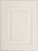
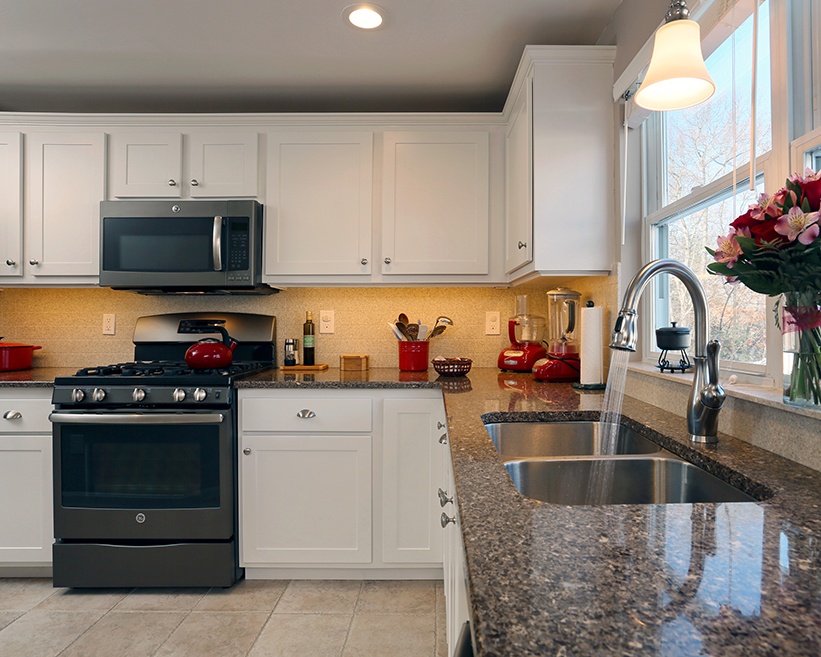
These days, classic Shaker cabinets in gray, whites and wood-tones are taking the nation by storm, and what says New England more than white, Shaker cabinet doors? It's a timeless combination and makes a distinct impact in any kitchen update.
Use countertops to create interesting texture
The previous countertops were white Formica, and there's nothing textured about that. To bring in some contrast - via texture and color - our client chose Cambria quartz countertops in Halstead, which include chocolate, gray and cream tones.
The countertop design mimics a nice, rich granite slab so you get all the beautiful benefits of mineral-esque patterns with more durability, increased sustainability and zero maintenance.
Create interesting transitions
Since the homeowner's original kitchen was on the bland side, she was determined to design a kitchen with some pizzazz, texture and contrast. That being said, she wasn't about to have poppy red countertops with eggplant walls either.
Backsplashes are the best example of where a transition occurs in a kitchen design, bridging the space between the countertops and the cabinets. In this kitchen, we selected a routed, Corian, solid-surface backsplash in Sahara. Corian works well with both Quartz and granite slabs because it comes in a wide range of colors, allowing you to choose one that resonates with the pattern in the countertop slab, and that transitions between counters and upper-cabinets.
Square patterns are popular, and timeless, and the Sahara color picks up some of the creamy tones from the countertop - yet infused with a cheerful dose of lemony yellow. Our client added splashes of bold red via changeable accessories, like her tea pot, blender and food processor.
Gain space by optimizing existing features to the max
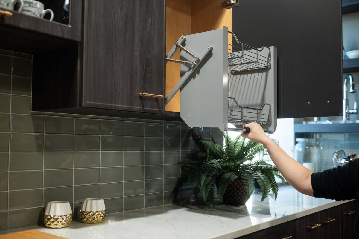
Wish you had room to add an island or pantry? Don't fret about it. Instead, put that energy to work planning ways to optimize existing features to the max. We added pull-out drawers and shelves, lazy Susans and customized storage interiors, allowing existing countertops to remain free of countertop clutter. In the end, you wind up with the same surface area you hoped to gain with an island, for a fraction of the price.
Now, this homeowner thoroughly enjoys her bright, and cheerful kitchen. Taking a kitchen from outdated to contemporary, or from blah to exciting, completely transforms how you think of the space. It gives you a feeling of awe and pride every time you walk in the room, and encourages you to take on those as-seen-on-TV recipes and entertaining ideas you've wanted to put into action.
It's your kitchen, so get inspired! The refacing possibilities are vast and you'll have plenty of budget leftover for all the little extras


