Worried that a mostly-white kitchen design will look cold, stark and boring?
Today's kitchen remodel is proof that white can be warm, inviting and cozy when it's used in conjunction with the right features and details.
Bring On the Mostly White Kitchen Design
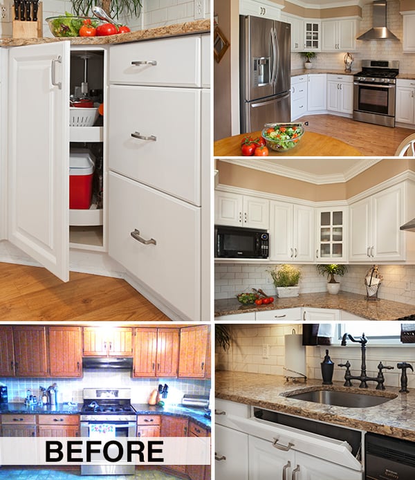
This kitchen was a living example of how refacing the cabinets and adding a brand new counter top completely transforms a kitchen. Those 1960-era walnut cabinets didn't reflect this young couple's style whatsoever. Their remodel is also an example of how refacing cabinetry can change everything!
Financial Design Tip 101
By choosing to take advantage of cabinet refacing, these young homeowners were able to spend more of their hard-earned savings on extra design finishes and details that made their finished remodel a showpiece for family and friends.
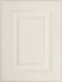
For this cabinet refacing project, homeowners selected Prestige style square cabinet doors in Frosty White. They made sure to select a door with a subtle edge detail, which is seemingly invisible at first, but adds interest and dimension - preventing the "flat" or "boring" look that all-white kitchens can exude if you aren't careful.
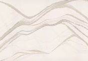
To anchor the white cabinetry in an earthy warmth, the homeowners selected Cambria counter tops in the color Buckingham. Then, they selected a sophisticated subway tile back splash in a slightly off-white shade, which creates a nice transition between the counters and cabinets.
Take it to the Ceiling
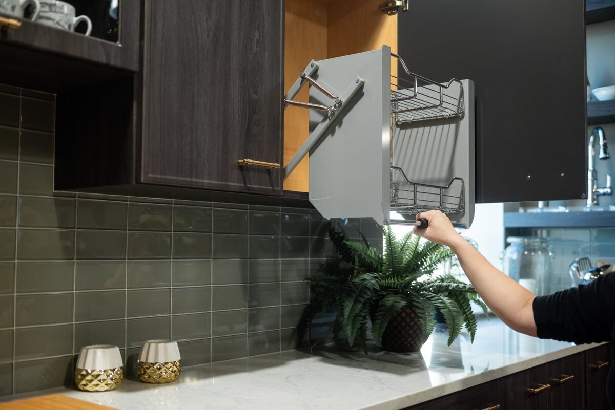
In a design-savvy move, they opted to eliminate the micro-sized cabinets above the stove top (customized storage options installed in their refaced cabinets more than made up for that lost space!). This allowed them to take the back splash all the way up to the ceiling - leading the eye to their stunning double crown molding with embossed rope trim.
Speaking of upscale design details; notice how Cambria’s Buckingham tones of taupe and cocoa are tied into the rest of the design? We did this by using a taupe grout for the back splash (a smart move since white grout tends to darken over time) as well as the light mocha wall paint that runs along the perimeter soffits.
Hardwood Floors
Hardwood floors are another warm and earthy anchor, allowing this kitchen to have that bright and airy feel, that white kitchen designs are known for, while still creating an inviting and cozy atmosphere. In fact, this kitchen isn't all that big, but you'd never know it now that intentional design features give this kitchen a spacious look.


