Ready to view some fantastic "Before and After" photos? Well, you got it because this is one of our favorite Kitchen Magic transformations yet.
These Skillman, NJ homeowners were tired of their builder's grade, shaker-style cabinets. The banks of darker-stained cabinetry made the kitchen feel small and closed off. The effect was lackluster and in no way complimented the rest of the home's sophisticated decór.
Enter our Kitchen Magic design consultant and the homeowner's personal Interior Designer, Nicole Lorber. Together, we decided to:
- Reface the existing cabinets to save more than 50% of the homeowner's cabinet budget planned for new cabinets. This made it possible for homeowners to spend the extra funds on other, luxurious remodeling accents.
- Lighten and brighten the cabinets for a more spacious and open feel.
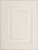
- Use Vintage Raised panel style doors for a more traditional look.
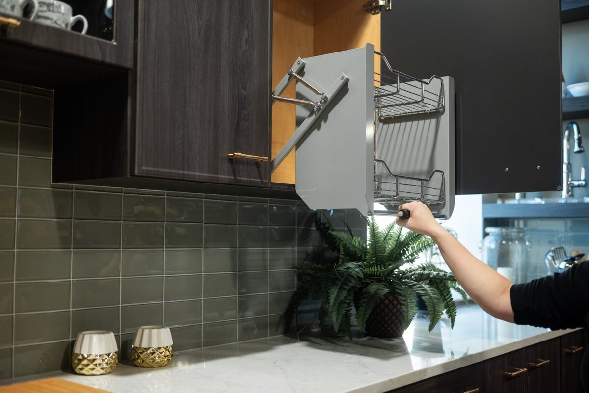
- Maximize storage and functionality, including pull-out shelving, trash roll-outs and lazy Susan corner storage.
Great Design and the Right Accents Create Attractive Focal Points
Part of what makes this kitchen so great are all the "just right" design details and accents. For example:
Just add glaze
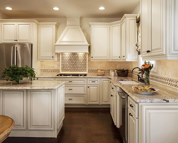
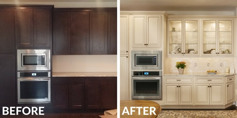
The owners selected Frosty White cabinetry to create the lighter ambiance they were going for. The raised details on the Vintage Raised doors are perfect for trapping glaze, so we finished them with a Coffee Glaze to warm things up a bit - it's a look that continues to trend.
Create an eye catching backsplash
These owners wanted a backsplash that pops a bit. The white subway tile background is accented with a geometric, diamond pattern in a rich brown, pulled from the darkest shades in the countertop and also complimenting the Coffee Glaze of the cabinetry. The pattern is contemporary but has a timeless quality that will keep it relevant for decades.
Design your own hood
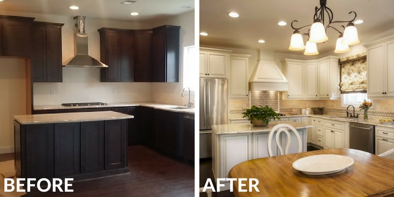
The hood is such a functional kitchen piece, but it can also be an artistic one when designed well. We got rid of the existing, plain Jane stainless steel hood and our in-house team got to work designing one especially for this Skillman, NJ kitchen remodel. We embellished the hood with appliques and moldings that add interest and tie into the cabinet design. Finally, we painted the hard maple wood the same Frosty White with a Coffee Glaze finish.
The hood pairs with cabinetry, offering complexity of color and texture, without going overboard.
Through the looking glass
If we had to choose a pièce de résistance, it would have to be the show place we created to display the homeowner’s collected treasures. What a difference it makes when you choose glass cabinet door inserts rather than solid ones. It breaks up the monotony of wall-to-wall cabinets, adds visual space and allows you to bring color and/or pattern into the design mix via some beautiful dishware or unique collections.
Ready for an upscale kitchen transformation of your own? We can't wait to get to work on it. Schedule a free, in-home design consultation and begin planning ‘your kitchen’s possibilities’!


