And you thought choosing the countertop was a challenge...
Sometimes, designing a backsplash is equally as tricky. There are multiple considerations, and each idea depends on the effect and feel you're going for.
We've become huge fans of glass tiles for several reasons:
- They come in a tremendous array of colors/surface finishes/textures, etc. so they pair with any countertop selection.
- Their unique, translucent look yields a captivating luminescence.
- Glass tiles are often 100% made from recycled glass, making them a wonderful option for homeowners focusing on a sustainable design.
- Glass tiles are available in all shapes and sizes, and different levels of opacity (yes, that's a word! It means a surface's tendency to be opaque).
Here are some tips on how to use glass tiles for your backsplash design.
Create the right transition
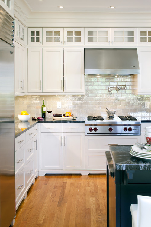
Backsplashes are there to protect wall surfaces from food splatter and moisture. That's the functional aspect. From the design perspective, backsplashes exist to create a transition between the countertop and the cabinetry, which may or may not have similar colors in common.
- If your cabinets share some of the primary countertop shades, use tiles that create a little contrast between the two.
- If cabinets share a barely-there shade in the countertops, create a patterned backsplash that builds up to that.
- If cabinetry is a completely different color, your solid or patterned glass tile backsplash can be the bridge that connects them using complimentary and contrasting tones.
Your backsplash can be any size you want, from the older 4-inch standard, to 6-inches, to 18-inches to full. It all depends on the look you want and your budget.
Find the right pattern
Are you interested in designing an eye-catching pattern? There are so many ways to go about it. Again, the countertop will play a large role in the way your backsplash pattern is created.
What you want to think about here is balanced artistry. Balance is created by choosing colors and patterns that don't overpower the ultimate finish, and artistry is created by the pattern you choose.
If your countertop is heavy with color and pattern, we recommend a monochromatic scheme in a complimentary shade. This way, the solid color - or subtle color variations - aren't in competition with the busy slab. Now you can have that ornate geometric pattern or enjoy the pattern created by a uniquely shaped tile (honeycomb, anyone?).
Patterns are also created by the simple act of alternating colors or tile sizes. Again, if you like the idea of a pattern with varied colors, but your countertop is busy, you can work with different shades of the same color hue, and that will create a stylish pattern that isn't competing with the countertop.
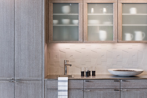
Color and texture
Color and texture are closely related to the topic of pattern. The simple act of interspersing a variety of colors will add both pattern and texture to your backsplash. On the flip side, choosing a pattern created in single-colored tiles creates a muted, textural effect.
However, there are real textural options to consider. Glass tiles can be found in matte or shiny, and they can also be found with different surface textures. This can help to integrate a little texture into a kitchen that has too many of the same types of finishes (very common in sleek, modern designs). For example, if you select a very mildly patterned Corian countertop, and your cabinets are painted the same color, your backsplash will be begging for textural oomph!
Having a hard time deciding? The Kitchen Magic design team is here to help.